
Hawkeye: Component Plot
Available in the classic overview page (see preferences, section 0) or in custom pages (FFT section of the tool box). Below is a screenshot of the overview page with frequency component plot:
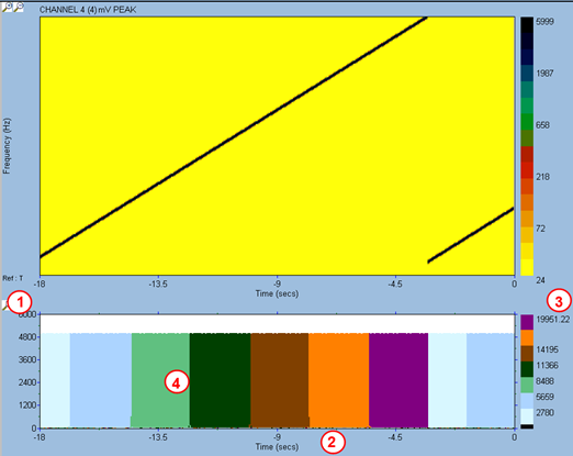
- Amplitude scale
- Time scale. If user switches to speed scale on the Campbell plot, the component plot will follow.
- Frequency colour scale: the FFT bandwidth is divided into 7 frequency ranges, of equal bandwidth.
- For each incoming spectrum, the component plot works out the maximum amplitude within each band. For each band, a vertical bar of the colour of the band is drawn; the height of the bar correspond to the maximum amplitude in the frequency band. For a given spectrum, the 7 bars are drawn on top of each other, starting with the band with highest amplitude, and going by decreasing amplitude. On the example above, we have a 5000 mV peak sine wave sweeping from 1 kHz to 20 kHz. At relative time 0 (current time), the sine wave frequency is within the 2780-5659 Hz band (pale blue colour).